Create Percent Bar Graphs
Subject: Math
Grade: Sixth grade
Topic: Data And Graphs
Please LOG IN to download the presentation. Access is available to registered users only.
View More Content
Percent Bar Graphs: A Tool for Understanding Data
– What are Percent Bar Graphs?
– A graphical representation of data where each bar reflects a percentage value.
– Visualizing Data with Graphs
– Graphs turn numbers into pictures for easy comparison.
– Everyday Importance of Graphs
– Graphs help us make decisions based on trends and comparisons.
– Creating Your Own Percent Bar Graph
– We’ll learn to convert percentages to visuals using bar graphs.
|
This slide introduces students to the concept of percent bar graphs as a means of data visualization. Begin by explaining that a percent bar graph is a way to show data as parts of a whole, with each bar representing a percentage. Emphasize the importance of graphs in everyday life, such as in weather forecasts, sports statistics, or election results, where they help us understand complex information quickly and clearly. Engage students by discussing how visual representations of data can make it easier to spot patterns and compare information. Conclude by telling students they will have the opportunity to create their own percent bar graphs, which will help them to better grasp the concept of percentages and their visual significance.
Understanding Percentages
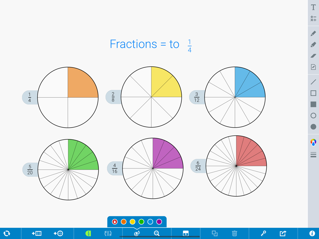
– Percent: a part out of 100
– Percentages in daily life
– Discounts, test scores, and statistics
– Convert fractions to percents
– Divide the numerator by the denominator, then multiply by 100
– Convert decimals to percents
– Multiply the decimal by 100 to get the percent
|
This slide introduces the concept of percent to the students, explaining that it is a way to express a number as a part of 100. Use relatable examples such as sale discounts, test scores, and statistics to illustrate the use of percentages in everyday life. Teach students the methods to convert fractions to percentages by dividing the top number of the fraction (numerator) by the bottom number (denominator) and then multiplying by 100. For decimals, guide them to simply multiply by 100 to find the percentage. Provide practice problems for both conversions to ensure understanding. Encourage students to think of other areas where percentages are used and to bring examples to class.
Introduction to Percent Bar Graphs
– What is a percent bar graph?
– A visual representation of data where the bar length represents a percentage.
– Key components of bar graphs
– Includes title, axes labels, bars, and a percentage scale.
– How to interpret data
– Analyze the length of bars to understand the data’s percentage.
– Practice with real examples
– Use examples like class survey results to create a percent bar graph.
|
This slide introduces students to the concept of percent bar graphs, which are used to display data in terms of percentages. Each bar graph consists of a title that explains what the data is about, axes that are labeled to show what is being measured, individual bars that represent data points, and a scale that indicates the percentage each bar represents. Students should learn how to read the graph by comparing the lengths of the bars, which correspond to the percentage values. To reinforce the concept, provide real-life examples such as survey results on favorite school subjects or daily time spent on various activities, and guide students to create their own percent bar graphs as practice.
Understanding Percent Bar Graphs
– Difference from regular bar graphs
– Percent bar graphs show data as a percentage of a whole, unlike regular bar graphs that show actual numbers.
– Represent data with percentages
– Each bar represents a percentage, which helps in comparing different categories easily.
– Advantages of percent bar graphs
– They provide a clear visual of parts to whole relationships, making complex data easier to digest.
|
This slide introduces students to percent bar graphs and how they are used to represent data. Begin by explaining the difference between regular and percent bar graphs, emphasizing that percent bar graphs show each category as a part of a whole (100%). Discuss how using percentages can simplify the comparison of different data sets, regardless of their actual size. Highlight the advantages of percent bar graphs, such as their ability to make complex data more understandable and to clearly show comparisons. Encourage students to think about situations where this type of graph would be particularly useful, such as in survey results or demographic data.
Creating a Percent Bar Graph
– Collect and organize data
– Gather data relevant to your topic and sort it into categories.
– Calculate percentages per category
– Use the total to find the percent each category represents.
– Draw and scale the bar graph
– Each bar’s height should reflect the percentage of its category.
– Label and present your graph
– Ensure your graph has a title, labels, and is clear to understand.
|
This slide outlines the steps to create a percent bar graph, a visual tool for representing data. Students should start by collecting data on a topic of interest and organizing it into clear categories. Next, they will calculate the percentage that each category represents out of the total. When drawing the graph, it’s important to scale the bars correctly to reflect these percentages. Finally, students should label their graph with a title, axis labels, and ensure that it is easy to read. Encourage students to choose a topic they’re passionate about, as this will make the activity more engaging. Provide examples of categories and percentages to help them understand the process.
Class Survey: Favorite School Subjects
– Conduct a survey on favorite subjects
– Calculate percentages from results
– Divide the subject count by total responses, then multiply by 100
– Create a percent bar graph
– Each bar represents percentage of students who favor a subject
– Interpret the graph findings
– Discuss what the graph reveals about class preferences
|
This slide is designed to guide students through the process of creating a percent bar graph based on a class survey about favorite school subjects. Start by conducting a survey in class, then teach students how to calculate percentages from the collected data. Next, show them how to represent this data visually using a percent bar graph. Each bar on the graph will correspond to the percentage of students who prefer each subject. Finally, encourage students to interpret the graph, discussing what it reveals about the preferences of the class. This activity will help students understand how to translate numerical data into a visual format and how to analyze that data to make conclusions.
Practice Time: Creating Percent Bar Graphs
– Let’s draw a percent bar graph!
– Our data: Class snack preferences
– What snacks do we like? How many votes each?
– Work in pairs for calculations
– Find the percentage each snack got
– Sketch your percent bar graph
– Use a ruler for straight lines, label clearly
|
This slide initiates a hands-on activity where students will apply their knowledge of percentages and bar graphs to a real-world scenario: their own snack preferences. Provide a data set that includes the number of votes each snack received. Students should work in pairs to calculate the percentage of the total votes each snack got. Then, they will draw a bar graph representing these percentages, ensuring their graphs are neatly drawn and accurately labeled. This activity will reinforce their understanding of how to convert raw data into a visual representation and interpret it. Encourage creativity while emphasizing the importance of accuracy in their calculations and graph construction.
Class Activity: Craft Your Percent Bar Graph
– Select a survey topic you like
– Gather data from classmates
– Calculate percentages for your data
– Use the formula: (part/whole) x 100%
– Design and present your bar graph
– Use colors to differentiate data
|
In this interactive class activity, students will apply their knowledge of percentages and bar graphs to a real-world scenario. They will start by choosing a topic that interests them, such as favorite school subjects or preferred snacks. After collecting responses from their peers, they will use the data to calculate the percentage each category represents out of the total. Students will then create a bar graph to visually present this information, using different colors to represent different categories. This activity will help solidify their understanding of percentages and how to visually represent data. Teachers should circulate the room to assist with calculations and graph design, ensuring that each student is engaged and understands the concepts being applied.
Review: Percent Bar Graphs
– Recap on percent bar graphs
– Visual tool for comparing data in percentages
– Encourage student questions
– Discuss real-life applications
– Budgeting, election results, or class surveys
– Highlight importance of skill
– Understanding data representation is a key math skill
|
Begin the slide by summarizing the key points about percent bar graphs, emphasizing their role in visually comparing different quantities as percentages. Open the floor for students to ask questions or seek clarification on any aspect of percent bar graphs they may find challenging. Engage the class in a discussion on how understanding and creating percent bar graphs can be useful in real-life scenarios, such as managing personal finances, interpreting election results, or analyzing class survey data. Reinforce the idea that being able to represent and interpret data is an essential skill in math and in everyday life. Provide examples and encourage students to think of other areas where these skills could be applied.
Homework: Percent Bar Graphs of Family Movie Preferences
– Create a percent bar graph
– Show your family’s movie preferences visually
– Interview family for data
– Ask what movies they like and why
– Gather favorite movie choices
– Tally up the votes for each movie
– Present your graph in class
|
This homework assignment is designed to apply the concept of percent bar graphs to a fun and relatable topic: family movie preferences. Students should interview their family members to find out which movies are favorites and then use that data to create a percent bar graph. This will help them understand how to represent data visually and practice calculating percentages. Encourage students to be creative with their graphs and to be prepared to explain their findings during the next class. This activity will not only reinforce their understanding of percent bar graphs but also enhance their presentation skills.

